
About a decade ago when I first got interested in heraldry, I came across this article in The Independent by Ben Summers and Michael Streeter, dating all the way back to 24th March 1997, early in that year’s general election campaign*. It concerned the use of the British royal arms by the Baroness Thatcher on her official letters.
The wording of the article is a little confusing, and made harder by the absence of any images (unsurprising given the age): It alleges that Lady Thatcher abandoned the use of her own coat of arms for her letters and started using instead the royal arms, in the lesser format favoured by various government departments.
.svg)
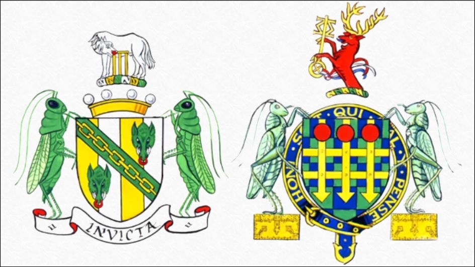
Thatcher’s own heraldic achievement
The journalists interviewed both Black Rod (Sir Edward Jones) who awkwardly declined to comment and Somerset Herald (Thomas Woodcock, later Garter King of Arms) who dismissed a suggestion (made by whom it’s not clear) that Companions of the Garter are specially entitled to use the royal arms in this way.
_(St_Edwards_Crown).svg)
Government arms as used at the time
The article contrasts Thatcher to Britain’s two other living former premiers at the time – “Sir Edward Heath uses a simple House of Commons portcullis and a plain typeface, while Lord Callaghan simply types his name beside the House of Lords logo.” – and the main thrust is the piece is to play up the public perception of the Iron Lady as not being able to leave government behind and as believing herself as great as the reigning monarch.
Trouble is, I think this is a bit of a reach, given this sentence: “The normal House of Lords logo used by peers places the Arms inside an ellipse, together with the words “House of Lords”, making clear the state body to which the use of the Arms relates.”
With one hand Streeter & Summers allege delusions of grandeur based on Thatcher’s supposed use of the governmental coat of arms instead of the House of Lords logo, but with the other they tacitly admit that the two devices are near-identical anyway! While the page itself does not have any photographs, I have been able to find a handful of examples online as letters by public statesmen often become collectable items sold at auction. The impression I get is that, while letterheads for members of the House of Commons have favoured the crowned portcullis badge** since many decades before Thatcher’s premiership, those for members of the House of Lords at that time used the royal arms in an oval with “House of Lords” typed underneath. Letterheads for government ministers at that time followed the same pattern – the royal arms in an oval with the department name beneath – although there were some rare examples of ministries already using the more modern corporate-style logos that would become characteristic of the New Labour years.
If the authors meant that Thatcher was using the royal arms in her private correspondence – i.e. not related to her parliamentary duties – then they might have had a point, but that is not made clear. I would also note that in all the photographs I’ve found so far, none show peers using their private coats of arms in the headers – a shame, really, as that is one of the main reasons to acquire a coat of arms in the first place.

This could be an example of what the article alleges – albeit it’s from seven years too late.
I’ve tried searching for any documentation of the actual rules around the use of parliamentary letterheads. I found this page for the House of Commons but nothing so far for the Lords.
Here I have collated a series of examples of letters written by Lady Thatcher and other British prime ministers in their legislative (rather than executive) capacities.
Margaret Thatcher
- 1966-04-01: Letter to Mr & Mrs Bland, with no personal letterhead but logo in top left corner, featuring even lesser royal arms in a portrait oval with “HOUSE OF COMMONS” arched above it.
- 1971-10-27: Letter to illegible recipient with green portcullis in top centre and “THE RT. HON. MARGARET THATCHER M.P.” above it.
- 1976-10-28: Letter to Misses Brett and Watson, with blue portcullis in top left corner and “The Rt. Hon. Mrs. Margaret Thatcher, M.P.” along the top.
- 1991-12-09: Rear page of a letter to Ed Koch (former Mayor of New York City), with portcullis in blue in top left corner and “THE RT. HON. MARGARET THATCHER, O.M., F.R.S, M.P.” along the top, notable because she is no longer called “Mrs” but not styled “Lady” either despite Denis’s baronetcy.
- 1991-12-12: Letter to E. T. Freeborough with same layout.
- 1995-03-01: Letter to Rick Pallack with lesser royal arms (sans oval) in top left corner and “MARGARET, THE LADY THATCHER, O.M., P.C., F.R.S.” along the head.
- 2003-??-??: Message thanking an unidentified well-wisher for his condolences after the death of Sir Denis, featuring the House of Lords logo as described with “Margaret Thatcher” underneath it and “THE RT. HON. THE BARONESS THATCHER, L.G., O.M., F.R.S.” in the footer. “P.C.” is omitted for some reason.
James Callaghan
- 1990-09-16: Letter to Andy Wood with House of Lords logo in red and “THE RT. HON. LORD CALLAGHAN OF CARDIFF KG” above it in black. “PC” omitted here too.
Harold Wilson
- 1973-10-30: Letter to Geoffrey Davis, with House of Commons portcullis in top centre and “From: The Rt. Hon. Harold Wilson, OBE, FRS, MP.” above, all in green.
- 1994-05-??: Letter to Lynda Winston, with House of Lords logo in top centre and “The Rt. Hon. The Lord Wilson of Rievaulx KG, OBE, FRS.”
Alec Douglas-Home
- 1970-07-29: Letter to Klaus Kuhneumund, with oval House of Commons logo and “From: The Rt. Hon. Sir Alec Douglas-Home, K.T., M.P.” above, all in subtly inconsistent shades of blue.
- 19??-04-17: Letter to the Marquess of Lansdowne, with House of Lords logo in top centre and “From: LORD HOME OF THE HIRSEL K.T.” above it. “P.C., J.P., D.L.” left out.
Harold Macmillan
- 1978-02-22: Letter to Harold Smith, with “From the Rt. Hon. Harold Macmillan” along the top, with “OM FRS” omitted.. There is no parliamentary logo at all as he was not a member of either house at this time.
Edward Heath
- 1984-05-10: Letter to Felipe González, with portcullis in top left corner and “The Rt. Hon. Edward Heath, M.B.E., M.P.” along the top, all in blue.
- 1991-02-13: Letter from Heath’s private secretary Robert Vaudry to Sean Bryson with portcullis in top centre and “From: The Private Office of The Rt Hon Edward Heath MBE MP” above it, all in black.
- 2000-09-18: Letter to the Lady Harmar-Nicholls, with portcullis in top left corner and “The Rt. Hon. Sir Edward Heath, K.G., M.B.E., M.P.” along the top, all in blue.
More recent examples of backbench peers using the royal arms
- 2013-07-15: The Baroness Young of Old Scone
- 2014-08-05: The Baroness Warsi
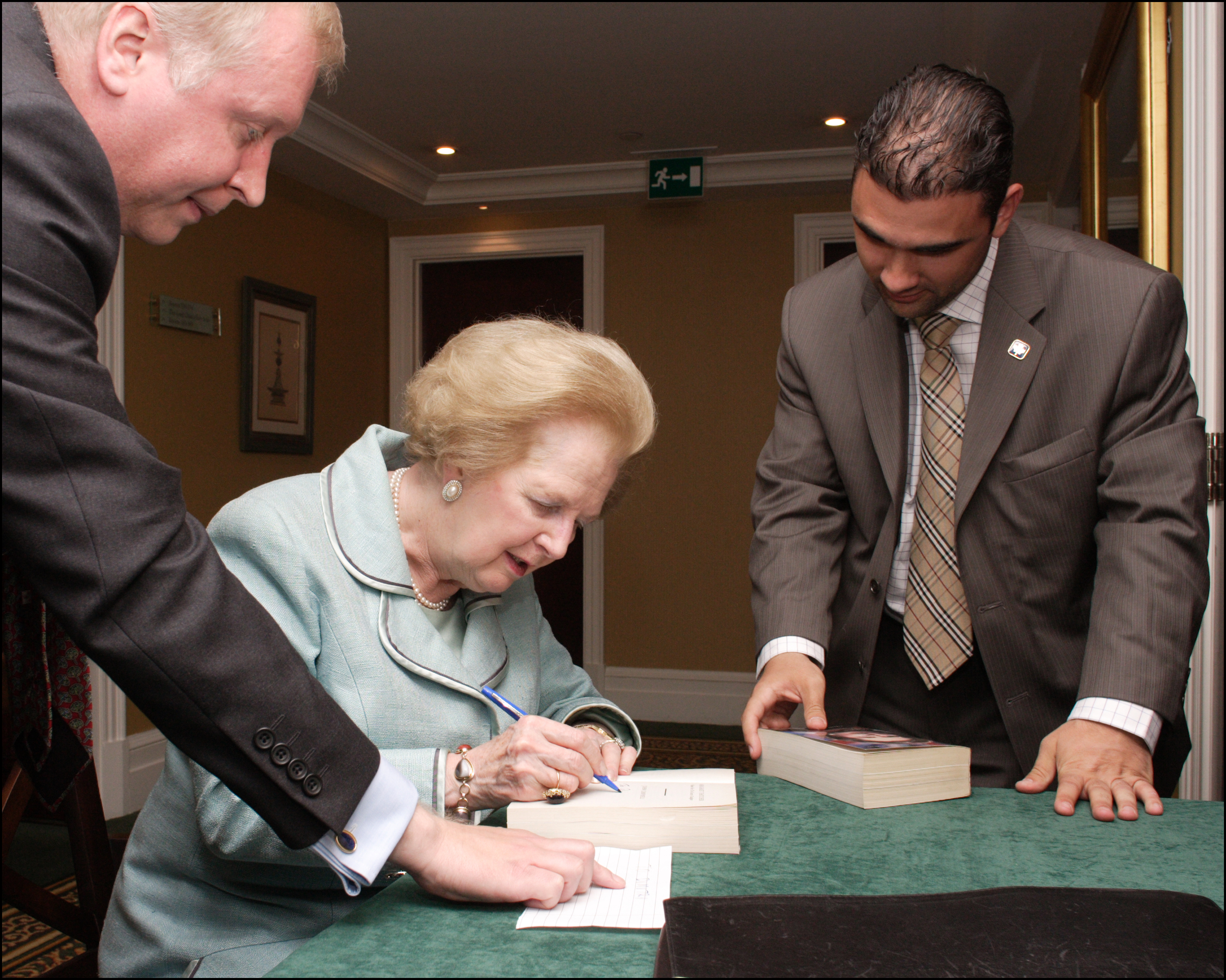
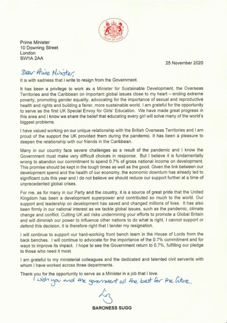
- 2020-11-25: The Baroness Sugg
On a semi-related note, I am still searching for evidence of armorial bearings held by Wilbert Awdry (who, incidentally, died just three days before that Thatcher article was published). Recently I have found some digital uploads of his letterheads, which feature a monochrome photograph of a steam locomotive, identified by the caption as Locomotive No.1 of the Sydney Railway Company. If he wouldn’t use a coat of arms there, where would he?
*The fifty-first Parliament of the United Kingdom was prorogued on Friday 21st March but would not be dissolved until Tuesday 8th April, with polling day on Thursday 1st May.
UPDATE (21st July)
Barely a day after I posted this, technology lawyer and academic Kendra Albert and software engineer Morry Kolman launched Heavyweight, an online letterhead composition tool which allows one to mimic the style of a legal firm. These letterheads are purely textual, so sadly no coats of arms to review.
