Everyone on the Same Page

Minutes of His Majesty’s Most Honourable Privy Council usually make for quite dry reading. Despite the speculations of conspiracy theorists, and apart from grand occasions such as the accession of a new king, plenary sessions are mainly filled by the appointments of new officeholders (especially in recent years, as ministerial churn as grown), amendments to charters of public bodies, closures of overcrowded graveyards, and the designs of commemorative coin series.

The formatting is similarly dull, being little but a list of links to PDFs, in which each order in council has its own A4 page with the main text in what I presume is Times New Roman with St Edward’s Crown (surrounded by the national floral badges) in the header. Beginning each document is a contents list typed in a sans serif font (most likely Arial).

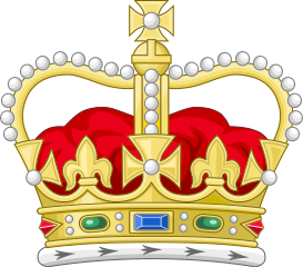
Last month, though, a small change was seen – the individual orders in council now have page numbers in their footers (in the sans serif font, and clearly not actually part of the order) while the contents pages now have hyperlinks in their right margins. A new front page has also been added, with the Privy Council Office prominently featured. The PCO’s logo is slightly different to that used by most other government departments – it features the royal shield encircled by the Garter and ensigned by the crown, but without supporters or motto. An interesting thing to note here is that although this stylistic modernisation debuted more than a year into the New Carolean era, the depiction used on the front page and in the orders themselves is still St Edward’s Crown and not the Tudor Crown as the current monarch apparently prefers.

EXTERNAL LINK

The Crown old and new

Early in the new reign, the College of Arms announced a new royal cypher for Charles III. A noted difference between this one and his mother’s (other than the name, of course) was the depiction of the crown.

“St Edward’s” crown, favoured by Charles II to Victoria

Up to and including Victoria’s reign, depictions of the crown in heraldic drawings could be inconsistent. Edward VII ordered a standardised depiction with simple arches, which has come to be known as “the Tudor crown” due to its resemblance to one supposedly commissioned by Henry VII or VIII (and seen in royal portraits up to the Civil War). Elizabeth II later decided to change this to a version with depressed arches, better resembling St Edward’s crown which monarchs actually wear at coronations, and which seemed to be favoured in heraldic drawings before Victoria’s time. The timing of these decisions created a general misconception that the Tudor crown is always used when the monarch is male and St Edward’s when the monarch is female. Charles’s decision is likely to reinforce that belief.

The “Tudor” crown, as used by Edward VII-George VI

On the day of the coronation, the Canadian Heraldic Authority unveilved their own new version of the crown, intended to be more distinctly Canadian. The overall shape of the crown is still based on the Tudor version, but the jewels have been replaced by a wavy blue line, the uppermost cross by a snowflake (as already used in the Order of Canada) and the crosses around the rim by – of course – golden maple leaves. The removal of explicit Christian symbols may be due to the lack of an established church in Canada, though the omission of fleurs-de-lis is a little perplexing, given the constitutional importance of the country’s French heritage.

https://upload.wikimedia.org/wikipedia/commons/thumb/d/d4/Crown_of_Canada_2023.svg/248px-Crown_of_Canada_2023.svg.png

The Canadian crown, as used by Charles III

It is not clear on exactly what timescale the new crown is to supersede the old. Four days after the coronation the government of Canada released a revised Canadian passport design. Though many radical changes have been made, the 1952 depiction of the crown retains pride of place. It is also not certain whether this will apply to the parliamentary maces. Currently the mace of the House of Commons is modeled on the Tudor crown while that of the Senate is modeled on St Edward’s. This is reflected in the heraldic badge of the parliament, showing both maces in saltire behind the shield. Funnily enough, British passports, though updating the introductory text to reference His Britannic Majesty instead of Hers, also still seem to have the prior crown on their covers.

The shield itself (fleurs and all) remains unchanged. It was announced on the same day that the arms of Canada may be flown as a banner to represent Charles and all future sovereigns. Previously Elizabeth II’s flag had the royal arms of Canada with her personal EIIR cypher imposed on a hurt in the middle. The removal of the cypher brings Canada closer in line with British heraldic practice whereby the reigning monarch bears the arms of dominion undifferenced, as well as avoiding the hassle of redesigning the flag for each subsequent reign. It remains to be seen whether the heraldic banners of other members of the royal family will also omit their cyphers and keep just the cadency labels.

FURTHER READING

Some Developments, Old and New

My hobby as an amateur armorial artist has been going in earnest for six years now and is fast approaching 1,400 illustrations. Every now and again I go back to revisit one of my earlier works to see if it can be improved.

Today’s retrospective was Lord Walker of Aldringham, former Chief of the Defence Staff, whose arms I first did in January 2019. I found an old thread about it on r/heraldry and, predictably, they weren’t very impressed.

I set out to remake the shield from scratch, smoothing out the fracture of the orle, refining the colours and, crucially, making the acorns a little more recognisable. The main difficulty I had was fitting the four acorns above and below the chevrons, for this arrangement works more naturally with three. When reading the blazon on Walker’s page I saw that there was no source given for it, and set out to find one. Reading Debrett’s Peerage 2019 (page 4691) I discovered that there were indeed three acorns not four, and corrected the image accordingly. I must wonder how that error originated (since it was written as a word not a numeral, so a simple typo would be difficult) and how far it has proliferated.

With nine days to go until King Charles’s coronation, his cypher has started to be seen on the liveries of royal soldiers. The Yeoman Warders (or “Beefeaters”) at the Tower of London recently debuted their new blue undress uniforms, and the state trumpeters have updated theirs as well.

UPDATE (30th April)

I see that on the same day I uploaded my re-illustration the Prime Minister’s Flickr account published a photograph taken inside Westminster Abbey, with Walker’s banner hanging in the background. Sure enough, three acorns only.