 As we reach the end of the Railway Series’s 80th anniversary year, I take a look at this companion book put out by Christopher Awdry in 2005 as part of the franchise’s Diamond Jubilee. That of course means the book itself has now had its own 20th anniversary, and indeed last month an updated edition went out in celebration of that occasion. I have yet to read it, though, so my review here is only concerned with the original version. “Between the Lines” can be considered the literary equivalent of “behind the scenes” for the book recounts in brief the origin of the franchise, answers some frequently-asked questions, goes through each of the stories and prominent characters clarifying their details in the RWS canon as well as their real-life inspirations. It also includes some commentary by the author about the Sudrian endeavour as a whole. This book represents the second attempt at such a publication; the first was in 1987 when Wilbert Awdry wrote The Island of Sodor — Its People, History and Railways. Christopher wrote this book because PH&R was becoming scarce and the publishers would not agree to another print run, as well as to take account of new material in the series itself since then†.
The introduction recounts the well-told tale (by his own admission) of Christopher being confined to bed with measles in 1942 and his father making up railway stories to entertain him, then getting involved with his own model railway, then being encouraged to turn the stories into proper books, then publishers’ requests for multiple sequels until a substantial corpus had been produced. Once said corpus had established itself, questions about lore and continuity were inevitable, from Wilbert’s own children and from the paying audience. He therefore set about creating a detailed fictional world in which his stories could take place. He took the name Sodor from the Diocese of Sodor and Man, drawing the island itself as an expansion of the the isle of Walney. Over time he and his brother George undertook a project of serious research into history, geography, geology and etymology to flesh out an authentic and plausible setting for the stories. Comparisons to Tolkien and the “sub-creation” of Arda are obvious, though mercifully Awdry’s legendarium is much more manageable in volume and scope‡. The main difference, of course, is that rather than fading millennia into distant past, the history of Sodor continues into the present day.
The biographies of the major characters (both mammal and metal) are generally written from a diagetic perspective, though often leaning quite heavily on the fourth wall (“Percy defies certain identification, and it sometimes appears that he was put together by using any appropriate parts that came to hand…”) and other times walking through it (“[Sir Topham Hatt] is, in fact, based on no-one in particular.”).
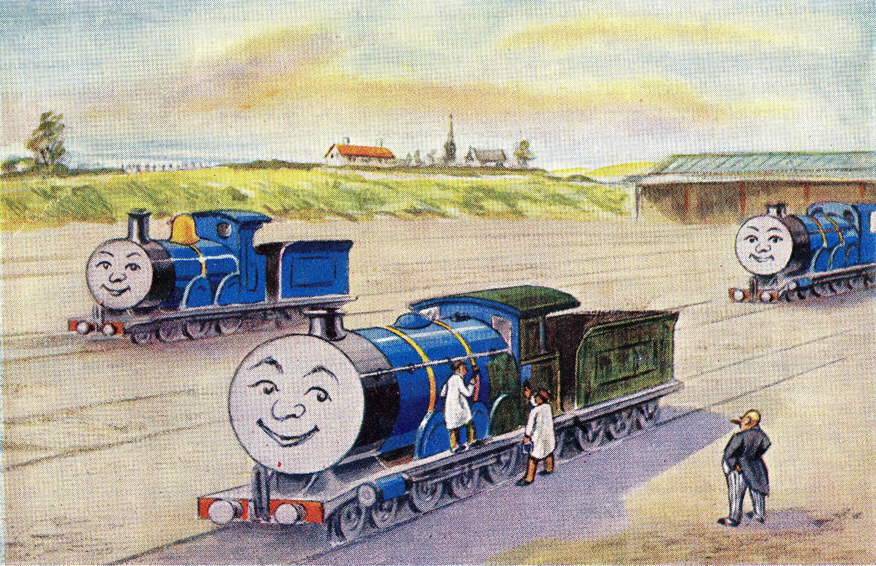
Four important figures in Sodor’s railway operations are established as hereditary identities: The “Fat Controller” of the North Western Railway represents three generations of the Hatt baronets, the present of whom was born in 1941; ownership of the Skarloey Railway is by two Sir Handel Browns (also baronets) with a third in waiting; the “Thin Controller” of said railway is a post given to the Sam family and even then foreman “Mr Mugh” is really father Ivo and son David. A noted exception is Francis Duncan⸸, the “Small Controller” of the Arlesdale Railway, who is said to be a lifelong bachelor planning to retire soon with no successor named.
The recap of all the stories notes where on the island they were meant to take place (sometimes highlighting improbabilities such as Toby being at Wellsworth goods yard in Dirty Objects) and the incidents on which they were based: Thomas Goes Fishing derives from a story about a Glasgow & South Western driver putting fish in his engine’s tank “to keep the water clean”; Percy’s Predicament from an accident at Swanley Junction in 1876; Smokescreen from a real wedding disaster on the Bluebell Railway.
Though most of the book is an earnest retelling of the facts (err… fictions) there are occasions where Christopher veers into satire and polemic: On the matter of electrification he says “since a change of locomotive would be necessary there anyway — or at least until the route from Carnforth to Barrow is electrified (“Fat chance!” do I hear you say?) — The Fat Controller has shelved the plan.”; on the disuse of the nickname “Fat Controller”, in Canada and the United States, “I cannot feel that down at grass roots the PC movement on this point, even over there, is really as strong as it must have been made out to be.”.
There are many points in the book where the author is surprisingly candid about his frustrations with both the book publishers and the television studios:
- “despite their classic status many of these books have been out of print for up to 10 years, a scandalous situation… the publishers, as you will read here, decided to change direction. The author is greatly saddened…” (inside cover)
- “we are thus forced to conclude that responsibility for the perceived lack of sales that I have been told about by the publisher must rest with their own sales methodology.” (p2)
- “some bizarre TV stories… elaborate dockside cranage at a port which has nothing like the amount of business to warrant it… for one who had made such a point of authenticity… such flights of fancy left a bitter taste.” (p4)
- “the publishers — Egmont Children’s Books — have claimed that falling sales make them commercially unviable. But if they aren’t there for people to buy in the first place no one can possibly know how viable they are, can they?” (p26)
- “The fact that the feature film Thomas and the Magic Railroad used the Isle of Man for locations was based, I suspect, more on tax breaks than because of any historical significance” (p30)
- [The name “Fat Controller” was dropped] “purely for “politically correct” reasons. In my view it is a great pity that Britt Allcroft was co-erced by the Americans into using the character’s proper name in order to sell her TV product over there.” (p31)
- “though when HIT Entertainment took over the rights in 2002 it was suggested that a return to original authorship was their policy nothing has so far (as at February 2005) happened.” (p31)
- “The story… gradually became watered down between fears of fright to readers from the publishers… until it became a shadow of its former self. A pity” (p65)
- “a last-minute publisher’s unilateral decision altered it [the book title] — it wouldn’t have been so galling had they not owed me t the annual sales conference to talk about it beforehand.” (p68)
The whole of the epilogue “Thomas: A Crown Worth Fighting For” is a heartfelt plea for the new rights holders not to let the books disappear from print or the quality of the TV series continue to decline.
As I said at the beginning of this review, I am reading the book with the benefit of two decades’ hindsight. This means that some of the open ends in the original have since been closed: On pages 32-3 Christopher considers that his own son Richard may one day take over the series, but says “I do not propose to hang a millstone that he may not want around his neck, and I certainly don’t take it for granted that he will carry on.”. It emerged earlier this year that Richard, now aged 45, has indeed taken over as “lore keeper” of the franchise and is giving lectures on the present state of the island, though whether he intends to write any more books is yet to be seen. On page 71 he hints that there are two new RWS books to come. He ultimately managed to get Thomas and Victoria published in 2007, followed by Thomas and his Friends in 2011. More concerning are the comments on page 72 about “the quality of the stories emanating from the Gullane company over the last few years”. He is presumably referring to seasons 5-7 (when Allcroft stopped adapting his stories) and 8 (when HIT imposed a new format). He had no idea of what was to come with the early CGI seasons, “Big World, Big Adventures!” and “All Engines Go”.
While Reading Between the Lines is not a particularly famous work among the general public, its audience, however niche, appreciates its existence greatly. Though there are some embarrassing proofreading errors (such as missing out The Twin Engines from the recap section, then giving the next book the wrong date) and ⸸inconsistencies with PH&R (such as calling the Small Controller Francis instead of Fergus), on the whole is is considered an authoritative, faithful and canonical testament to the wondrous world the Awdry clan created, and which continues to captivate so many of us to this day.
Finally, it is worth remembering that today marks one year since the death of Britt Allcroft. Despite the occasional controversial creative decisions she made (some of which are detailed above) she remains an invaluable figure in Sudrian history in her own right.
Footnotes
†Of course, that also then happened to RBtL itself, which is precisely why the new edition has had to be released. I was fortunate to be able to access digital copies of both books (although the scan of this one was quite crude) through the Internet Archive.
‡I was able to read this book, and PH&R, from my computer screen in a few days each and I’m fairly confident about . By contrast, I started reading my physical copies of The History of Middle-earth before this summer started. They felt like the sort of books best enjoyed by daylight when sitting in the orchard, which has become challenging in the winter months but I persevere. Even now I’m only at page 270 of Volume II and I still don’t entirely know my Eldalië from my Edain.


.svg)
_(St_Edwards_Crown).svg)


