A Look at Some Letterheads

In the past five days President Trump has in rapid succession hosted bilateral meetings at the White House with Emmanuel Macron, Sir Keir Starmer and Volodymyr Zelenskyy. I have not watched any of these events in full in order to write a proper political analysis – frankly, the small snippets I did see were already enough to leave me rocking in a corner – so am instead simply focusing on some aspects of government heraldry.

During a meeting in the oval office, Starmer gave Trump a letter from Charles III inviting him on a second state visit to the United Kingdom. The letter was marked “Private and Confidential”, yet presenting it in this way meant nearly all the words were caught on camera. I have copied out the text below (keeping the line breaks and punctuation the same) with equals signs representing the words that got obscured:

Dear Donald,

I just wanted to write and thank you for receiving====
in Washington so soon after your Inauguration. Given the====
breadth of challenges across the world, I can only think that====
of our two countries has a vital role to play in promoting and====
the values which matter so much to us all.

I remember with great fondness your visits to the United Kingdom
during your previous Presidency, and recall our nascent plan for you to
visit Dumfries House, in Scotland, as the global pandemic began and all
bets – and flights! – were off… I can only say that it would be a great
pleasure to extend that invitation once again, in the hope that you might at
some stage be visiting Turnberry and a detour to a relatively near
neighbour might not cause you too much inconvenience. An alternative
might perhaps be for you to visit Balmoral, if you are calling in at Menie.
There us much on both Estates which I think you might find interesting
and enjoy – particularly as my Foundation at Dumfries House provides
hospitality skills-training for young people who often end up as staff in
your own establishments!

Quite apart from this presenting an opportunity to discuss a wide
range of issues of mutual interest, it would also offer a valuable chance to
plan a historic second State Visit to the United Kingdom. As you will
====, this is unprecedented by a U.S. President. That is why I would find
it helpful for us to be able to discuss, together, a range of options for

location and programme content. In so doing, working together, I know
we will further enhance the special relationship between our two countries,
of which we are both so proud.

Yours Most Sincerely

Charles R

The letter is described as emanating from Buckingham Palace, and is topped by the familiar red outline of the British royal arms, still the old version with St Edward’s Crown.

On a related note, Starmer recently announced that, owing to the escalation of international military tensions, his government would be redirecting funds from international aid to defence. Anneliese Dodds, Minister of State for Development, resigned from the government in protest. The Prime Minister’s response to her resignation is published on Gov.UK as a PDF. His letterhead is the lesser version of the arms, again still using St Edward’s Crown.

One place (or rather a great many places) where the Tudor crown can now be seen in use is in the arms of Queen Camilla, as used by companies to which her royal warrant was granted late last year. The first example I’ve actually seen (through other heraldists pointing it out online, rather than in person) is Heaven Skincare, which proudly displays the warrant in the navigation bar of its website. Deborah Mitchell, the owner, Tweeted a photograph of the coat of arms on her branded packaging earlier today.

A Look at the Briefing Room

Having established that Downing Street Flickr photographs are free to use, let us look closely at a few of them:

There was a storm of press indignation in 2021 when it emerged that Boris Johnson had spent £2.6m on the outfitting of a dedicated press briefing room in Number 9 Downing Street, after nearly a year of doing daily COVID updates from what was supposed to be the state dining room.

The room was mainly wood-paneled, but with large blue blocks on the backdrop. The middle such block had a faint monochrome outline of the lesser royal arms printed on it.

Following last year’s general election, Sir Keir Starmer reverted to using the state dining room for a few months while the conference room underwent a minor remodeling. In its new guise the blue drapes (deemed too partisan) have been removed and the carpet changed to a neutral grey one. If future premiers also tinker with the design here, perhaps Britain will have some counterpart to the Oval Office after all, though I wouldn’t bet on it as the recent tradition of each incumbent getting a different lectern took over a decade for the press (let alone the public) to notice.

The lesser arms are still displayed behind the Prime Minister, now in white on a black oval. The recent illustration is used, showing the Tudor crown. It still appears that Elizabeth II’s lesser arms have not entirely been phased out though, since on a recent visit to Auschwitz a wreath was left with a condolence note on government stationery, the old version of the arms still clearly in view.

Second Look at Royal Variety

Three weeks after its recording, the Royal Variety Performance for 2024 has been broadcast. I have also found on the charity’s website some publicity stills from the event along with the official brochure.

The brochure contains a great deal of heraldic illustration, much of which is clearly of Sodacan origin. The artistic schizophrenia is evident even from the front cover, which prominently displays a full-colour Sodacan version of the royal arms with the Tudor crown while also having in the header a monochrome outline (similar to that on royal.uk) of the St Edward crown version as part of the Royal Variety Performance logo. Throughout the brochure the latter is included as part of the page header while the former is repeated many times as a main-body illustration. More curious is that in the borders of several pages another obvious Wikimedia graphic is seen – the coat of arms of the Prince of Wales. Quite why that one was used I am not sure, especially as Charles stopped using it upon his accession and it has yet to be conclusively shown that William now does so. The outline version also appears as the background pattern to some of the pages themselves. To make things even more confusion two more expressions of the royal arms appear in the brochure – in the letterhead of a message from Buckingham Palace on page 7 in the royal warrant part of the advertisement for Mikhail Pietranek Interior Furnishing and Design on page 65.

A quick glance at the brochures for past installments of the performance makes clear – even just from the front covers – that this armorial smorgasbord has been in effect for some time.

As far as the performance itself is concerned, I do not intend to write a detailed review. The one part I deem relevant to the ongoing themes of this blog is the section on the Lord Lloyd-Webber’s famous musical drama Starlight Express:

After the play’s own professional actors had done their carefully-choreographed routine, the night’s host Alan Carr came on for a comedy coda of sorts, wearing a much simpler steam engine costume and clearly much less steady on his feet. Lloyd-Webber himself was on stage at this point. Carr’s entrance was accompanied by the original Thomas & Friends theme tune. I found this amusing for two reasons:

  1. That theme debuted when the series began forty years ago, but then was replaced in Hit Entertainment’s retool of the franchise twenty years ago. Even though the theme has been out of use now for as long as it was in, it still achieves far greater cross-generational recognition than do any of its successors.
  2. Britt Allcroft’s 1984 production was not the first attempt at adapting Awdry’s books for television – Lloyd Webber had approached the vicar a whole decade earlier with his own pitch and had produced a pilot episode for Granada by 1976, but the studio declined to put it into production. This disappointment was the reason he made Starlight Express in the first place!


An addendum to the Qatari state visit

Video

A week after the event, the royal YouTube channel has uploaded a seventeen-minute video of the state banquet given at Buckingham Palace. The footage itself is the same as found on commercial news channels, but what catches my attention is the little animation at the end – the title card shows the line drawing of the royal arms that appears on the header of royal.uk, including St Edward’s Crown. I am a little perplexed that this is still being used for these purposes given that a new illustration with the Tudor crown now appears for the channel’s logo. This little animation does not appear at the ends of earlier videos, making it an innovation that only debuted after the artwork itself had already become obsolete.

First Look at Royal Variety

It won’t actually be broadcast for a few weeks, but 2024’s iteration of the Royal Variety Performance was recorded last night at the Royal Albert Hall. His Majesty was in attendance for the first time in his reign, having last attended (virtually) in the somewhat abnormal edition arranged for 2020. The Queen was supposed to attend with him (having also done so in 2013 and 2016) but dropped out at the last minute due to the relapse of a recent chest infection (which also stopped her attending the annual Festival of Remembrance at the same venue).

No photographs or film of the performances themselves have yet been seen, but publicity shots of the cast and attendees are available through commercial photographers, and they show the logo of the Royal Variety Performance printed on the wallpaper of the backdrop. It very obviously uses Sodacan’s illustration of Elizabeth II’s royal arms with St Edward’s Crown instead of the Tudor one. The charity’s website is much the same – the background has a monochrome outline of the full heraldic achievement similar to that on royal.uk and a smaller representation of the same appears in the footer. When you hover the cursor over it, the outline changes to a full-colour copy of Sodacan’s graphic. I wonder how long that will take to update?

Ironically the royal box inside the hall features a textile version of the royal arms with the Tudor crown, which was evidently erected there before Elizabeth II’s accession and left there throughout her reign without update until it eventually came back into style. All fashions are cyclical, one supposes, even if this particular rotation took a very, very, long time to complete.

The Sovereign’s Crown and the Southern Cross

The King & Queen in Sydney (NSW Gov, CC BY 4.0). The King’s mouth is unfortunately hanging open in this shot, which combined with the opaque glasses makes for a bit of a Hubert Farnsworth look.

The King & Queen have just spent the past nine days on a tour of Australia and Samoa. Bizarrely, the Palace’s press release called this an “Autumn Tour” even though in the destination countries it was spring. The tour was originally supposed to have included New Zealand as well, but His Majesty’s cancer diagnosis earlier this year forced the itinerary to be severely reduced.

Charles wore three distinct metaphorical “hats” during the course of the tour: First as King of Australia conducting domestic business, second as King of Great Britain & Northern Ireland conducting a bilateral state visit, and third as Head of the Commonwealth presiding over the biennial Heads of Government Meeting.

Photographs of the sovereign couple at these events are unfortunately few and far between. Australian governments both federal and state lack official Flickr accounts with clear licensing indications as their British counterparts have, and the paltry few hosted on their websites are also of uncertain origin – at time of posting a handful have been accepted on Wikimedia Commons but these all look so suspiciously similar to those on Getty and Alamy that I wouldn’t be surprised if they ended up getting deleted shortly afterwards. There seem to be no free-licence photographs of the state visit to Samoa at all. Number 10 and the FCDO both have albums from the CHOGM, but only one picture of the lot actually shows Charles and none at all show Camilla.

I do not know the full details of the travel arrangements, but what I can gather is that Their Majesties and a small entourage took a commercial flight from Heathrow to Singapore, whence they were picked up by the Royal Australian Air Force and taken to Sydney Kingsford Smith Airport in New South Wales.

The tour marked the first in-the-fabric appearance of the Australian royal banner of arms (known officially as “The King’s Flag for Australia”), which was seen flying from the cockpit window and then later from several road and watercraft. The Australian banner follows Canada’s example by reverting to showing the national arms undifferenced, in contrast to the practice followed during Elizabeth II’s reign of defacing the banner with her own personal cypher. The King approved the present version on 30th August.

The current coat of arms of Australia was formalised in 1912. The shield is a composite in “quarterly of six” format, representing the six constituent states of the federation. The states of South Australia and Western Australia did not yet have full coats of arms at the time but all had heraldic badges (which are also shown on their respective civil flags) so these were used instead. The whole is surrounded by a bordure ermine.

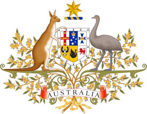
The whole federal armorial achievement is normally depicted with the crest on a torse hovering some distance above the shield – omitting helm, mantling or coronet – but the Imperial Crown appears as a charge on the badges of Victoria and Queensland, notably at different sizes.

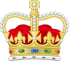
As in Britain (though unlike Canada) the depiction of the crown in Australian royal symbols has changed from St Edward’s Crown to the Tudor Crown, though this has not yet entirely filtered through to all the state arms and flags themselves. I dimly remember – but can no longer find the proof – that the flag as approved on the government’s website in August still showed St Edward’s Crown, and that the graphic on Wikimedia Commons did likewise until photographs of the real flag caused an update.

The King at several points on the tour wore the sovereign’s badge of the Order of Australia along with a hefty line of other honours I will need time to identify. The Governor-General gave him honorary commissions at the top ranks of all three branches of the Australian armed forces. This is is a little perplexing from a legal perspective: One would have thought that the reigning monarch would hold these ranks substantively ex officio and would not need to be appointed to them by his own deputy.

The Queen is another story: For months now I have been looking out for signs of Camilla being granted the use of her own banner of arms – being the royal arms of the sovereign impaling those of her father Bruce Shand. This was finally seen to be the case during the Australian tour, flying from the bonnet of her car on a few occasions when she travelled without her husband. The videos did not show the flag long enough (and the stills tended to have it covered by the watermark) but from what little I can determine of the artistic subtleties of its design I reckon it is actually a printout of the vector file on the Commons. The car itself was a black Audi (I think a Q8) and the regular numberplates were obscured with plates bearing an image of the Tudor Crown. That image looks to have been taken from Wikimedia too, though I can’t find the exact image. The glaring problem here, of course, is that this banner shows Shand impaled by the British royal arms rather than the Australian, resulting in a mismatch with her husband. There is a burning irony that after all this time, the one occasion Camilla can be seen using a personalised banner of arms as Britain’s royal consort is the one occasion in which it was not appropriate to do so.

This unfortunately seems to be far for the course with royal tours – with the notable exception of Canada (probably because that country has its own heraldic authority), banners of royal arms in the other Commonwealth Realms seem to only be made for the reigning sovereign himself, with the rest of the royal family defaulting to their British blazons instead of coming up with a local variant. This may be marginally more convenient from a logistical and fiscal perspective, but it can be constitutionally misleading as it implies that they are representing a foreign state instead of that country’s own crown. If creating a personal one for each prince or princess is too onerous, it at least would be relatively easy to create a generic ermine-bordered version which they could all use when in the country. Admittedly that might not work in Australia where the sovereign’s own shield and banner have an ermine bordure already. For the royal wives, it might even make more sense to use banners of their paternal arms unimpaled so that they needn’t change based on location at all.

During the visit, His Majesty attended a service at St Thomas’s Anglican Church in North Sydney, made addresses to both the state Parliament of New South Wales and the national Parliament of Australia (sadly not from the throne in either case) and undertook a review of the fleet. God Save The King was played by a brass band while Charles inspected the troops and also by a solo amateur flautist during his walkabout but I can’t find any clip of it actually being sung at any point, in contrast to Advance Australia Fair which was sung by a children’s choir at Parliament House. That the monarch made no remark about his late friend Barry Humphries (a.k.a Dame Edna Everage) was also a little surprising.

When the royal party landed in Samoa they switched back to their British identities and the British royal banner was flown from the cockpit window alongside the Samoan flag, although the aeroplane itself was still very obviously branded as Australian.

While in Samoa Charles was invested with two honorific titles – Tui Taumeasina (King of Taumeasina) and Toa’iga o Tumua (Paramount Chief). The Queen was seen using a hand-fan with her royal cypher printed on it, which was given to her by Stewart Parvin in February. Both switched for much of the visit to bespoke white outfits in the local style.

Charles attended the CHOGM in his capacity as Head of the Commonwealth. Elizabeth II adopted a personal flag to represent herself in this capacity with no reference to any particular country. Her son so far appears not to have done so, which is a pity.

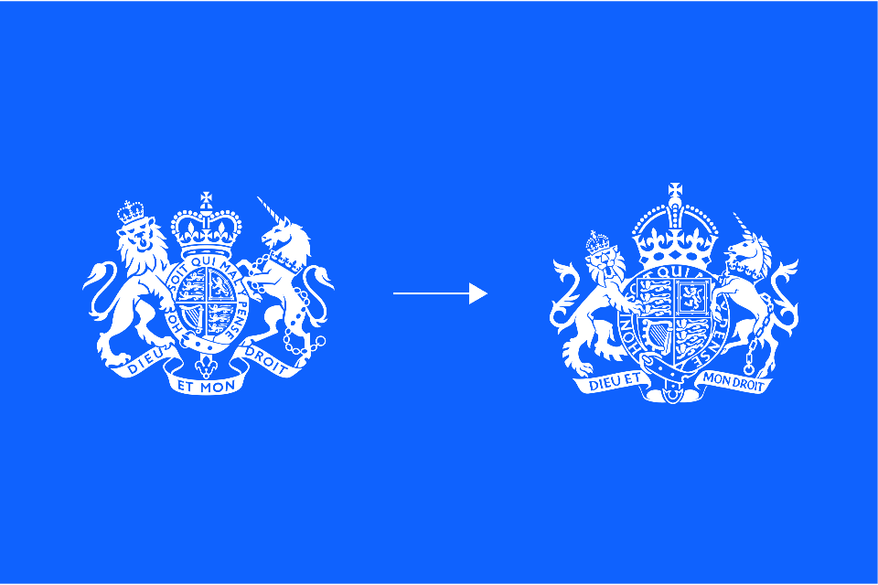
The official royal YouTube channel has uploaded some videos from these events. Not only are they continuing to use the outline of the British royal arms as the channel logo, they have also taken to including a new drawing of the arms in the thumbnails of individual videos. This, again, is a little problematic when the contents of the videos relate to other realms. I am left to wonder what recognisable symbol could be used here to avoid this problem. The livery badge of the House of Windsor might work, but even that technically has the British banner of arms included in it. The only solution that would truly work is, I suppose the CIIIR cypher on its own, without even a crown above it. Indeed, that could work for other family members’ flags and banners too.

New Government Arms

The latest development in a long-running story, yesterday the Cabinet Office announced the rollout of a new rendering of the British royal arms, based on an illustration by Timothy Noad, for use by HM Government, including in all departmental logos on the website. It will presumably also appear in the letterheads of governmental paper publications, but of course the appearance of those example will be less instantaneous.

The most obvious, and important, change is of course the change from St Edward’s Crown to the Tudor Crown, about which I have written before. The crown is also now depicted much larger relative to the other elements. The lion and unicorn supporters have also been redrawn in a much more chunky, angular style than in the old version.

The escutcheon is restored to a more traditional heater shield shape, poking out in front of the Garter circlet, whereas the old depiction had it as a fully-enclosed cartouche. The circlet itself has been enlarged and the motto typed in a serif font as well as having the colours inverted – it now matches the shield, supporters and crown by having the field depicted in negative while the charges and outlines are positive. The fleur-de-list at the end of the strap is gone.The motto scroll is now much flatter, but anomalously retains the old font and colour scheme.

Comparing the two overall, I would say that the new version looks better as an example of heraldic art due to the shield itself no longer being denied its due prominence, but the old version may work better as a corporate logo due to its stronger outline, especially when shrunk for low resolutions.

In other heraldic news, The Heraldry Society recently released a digital upload of 244 pages from Volume 6 of The Coat of Arms, and I have discovered the Fellowship of the White Shield, whose blog currently has nine articles on the subject. I will not be short of reading material in the foreseeable future.

The King’s Accession: Fast and Slow

The royal journalist Robert Hardman recently released his latest publication Charles III. New King. New Court. The Inside Story, which covers the end of the previous reign and the beginning of this one. Confusingly the same book seems to have been published under at least three titles: I’m also seeing it called Charles III: The Making of a Modern Monarch and The Making of a King: Charles III and the Modern Monarchy.

Reading the whole thing will obviously take some time, but I have managed to get through the first few pages, including those covering the decease of Elizabeth II. I was particularly fascinated by this passage:

…for visibility, Prince Charles was raised on his mother’s mantra that ‘I have to be seen to be believed’. Immediately after her death, it became clear that he would abide by this. Duties and conventions which might have been spread over many months at the start of the previous reign kicked in almost immediately. His first broadcast as monarch was recorded within twenty-four hours (Elizabeth II’s first broadcast, which was by radio, came ten and a half months into her reign). There would be visits to all the home nations within days. Court mourning, which continued for two and a half months after the state funeral of George VI, would end precisely one week after that of Elizabeth II. In less than three weeks, the King’s cypher, ‘CIIIR’ (Charles III Rex), was ready and released for immediate use on post boxes, military uniforms and official documents. It had taken more than five months before the design for ‘EIIR’ was approved in 1952. Investitures were up and running again within the month.

Of course, this is still slower than I would have liked, especially in heraldic, numismatic and vexillological matters: Sixteen months into the present reign, there is still uncertainty about the arms of The Queen and the Prince & Princess of Wales (especially in Scotland), as well as His Majesty’s personal banners in most other Commonwealth Realms. Though in almost all cases it is trivial to predict what they ought to look like, there are few in which I am certain that such designs have actually been granted. In addition, I am still yet to personally encounter any coinage or banknote bearing the current monarch’s face.

The slowness in updating online profiles is particularly baffling, given that it requires no physical material to be changed. This month there has been a hint of movement by His Majesty’s Revenue & Customs, whose Twitter icon now shows the Tudor crown, although the logo on the website itself still uses the St Edward version. The cover images for recent policy posts show both versions in use, suggesting that the filtering through of the new design is still ongoing.

UPDATE (19th February)

The crown logo is now updated across government websites.

Everyone on the Same Page

Minutes of His Majesty’s Most Honourable Privy Council usually make for quite dry reading. Despite the speculations of conspiracy theorists, and apart from grand occasions such as the accession of a new king, plenary sessions are mainly filled by the appointments of new officeholders (especially in recent years, as ministerial churn as grown), amendments to charters of public bodies, closures of overcrowded graveyards, and the designs of commemorative coin series.

The formatting is similarly dull, being little but a list of links to PDFs, in which each order in council has its own A4 page with the main text in what I presume is Times New Roman with St Edward’s Crown (surrounded by the national floral badges) in the header. Beginning each document is a contents list typed in a sans serif font (most likely Arial).

Last month, though, a small change was seen – the individual orders in council now have page numbers in their footers (in the sans serif font, and clearly not actually part of the order) while the contents pages now have hyperlinks in their right margins. A new front page has also been added, with the Privy Council Office prominently featured. The PCO’s logo is slightly different to that used by most other government departments – it features the royal shield encircled by the Garter and ensigned by the crown, but without supporters or motto. An interesting thing to note here is that although this stylistic modernisation debuted more than a year into the New Carolean era, the depiction used on the front page and in the orders themselves is still St Edward’s Crown and not the Tudor Crown as the current monarch apparently prefers.

EXTERNAL LINK

The Crown old and new

Early in the new reign, the College of Arms announced a new royal cypher for Charles III. A noted difference between this one and his mother’s (other than the name, of course) was the depiction of the crown.

“St Edward’s” crown, favoured by Charles II to Victoria

Up to and including Victoria’s reign, depictions of the crown in heraldic drawings could be inconsistent. Edward VII ordered a standardised depiction with simple arches, which has come to be known as “the Tudor crown” due to its resemblance to one supposedly commissioned by Henry VII or VIII (and seen in royal portraits up to the Civil War). Elizabeth II later decided to change this to a version with depressed arches, better resembling St Edward’s crown which monarchs actually wear at coronations, and which seemed to be favoured in heraldic drawings before Victoria’s time. The timing of these decisions created a general misconception that the Tudor crown is always used when the monarch is male and St Edward’s when the monarch is female. Charles’s decision is likely to reinforce that belief.

The “Tudor” crown, as used by Edward VII-George VI

On the day of the coronation, the Canadian Heraldic Authority unveilved their own new version of the crown, intended to be more distinctly Canadian. The overall shape of the crown is still based on the Tudor version, but the jewels have been replaced by a wavy blue line, the uppermost cross by a snowflake (as already used in the Order of Canada) and the crosses around the rim by – of course – golden maple leaves. The removal of explicit Christian symbols may be due to the lack of an established church in Canada, though the omission of fleurs-de-lis is a little perplexing, given the constitutional importance of the country’s French heritage.

https://upload.wikimedia.org/wikipedia/commons/thumb/d/d4/Crown_of_Canada_2023.svg/248px-Crown_of_Canada_2023.svg.png

The Canadian crown, as used by Charles III

It is not clear on exactly what timescale the new crown is to supersede the old. Four days after the coronation the government of Canada released a revised Canadian passport design. Though many radical changes have been made, the 1952 depiction of the crown retains pride of place. It is also not certain whether this will apply to the parliamentary maces. Currently the mace of the House of Commons is modeled on the Tudor crown while that of the Senate is modeled on St Edward’s. This is reflected in the heraldic badge of the parliament, showing both maces in saltire behind the shield. Funnily enough, British passports, though updating the introductory text to reference His Britannic Majesty instead of Hers, also still seem to have the prior crown on their covers.

The shield itself (fleurs and all) remains unchanged. It was announced on the same day that the arms of Canada may be flown as a banner to represent Charles and all future sovereigns. Previously Elizabeth II’s flag had the royal arms of Canada with her personal EIIR cypher imposed on a hurt in the middle. The removal of the cypher brings Canada closer in line with British heraldic practice whereby the reigning monarch bears the arms of dominion undifferenced, as well as avoiding the hassle of redesigning the flag for each subsequent reign. It remains to be seen whether the heraldic banners of other members of the royal family will also omit their cyphers and keep just the cadency labels.

FURTHER READING